Tuesday, September 16, 2014

New Release: Anastasia Beverly Hills Tamanna Palette


I received an email from Anastasia Beverly Hills announcing their newly released product: the Tamanna Eye Shadow Palette. It is presently available for online purchase on their website. It will hit stores in the near future (probably at the usual retailers of Ulta, Sephora, and Macys). I am so susprised that they released another palette so soon, the Maya Mia palette was released barely 3 weeks ago (you can see my review of it here).


Tamanna Roashan (@dressyourface) is yet another instagram makeup artist with a serious following that has caught the eye of Anastasia and her daughter, Claudia (you should really look up Tamanna, she does the most beautiful double-winged looks I've ever seen!). Anastasia Beverly Hills keeps bringing us fresh new faces from various ethnic backgrounds who have one thing in common: their love of beauty and style. I give serious kudos to Anastasia for sticking with this theme and making it a true collection. Tamanna chose all of the colors herself and they are her "must haves" which she religiously uses on clients of any skin tone.

The packaging is elaborate and has a repeating scroll pattern, inspired by the middle eastern and Indian background of Tamanna. It is beautiful just like every other palette in this collection, it's diversified and absolutely stunning packaging (I love how the packaging always reflects the shadow choices inside the palette).
For color reference, below this image I have included the Maya Mia Palette, the Amrezy palette, and the Lavish palette (Holiday 2013 release).

Fresh - creamy matte highlight; looks similar to Cream from the Lavish palette
Blush - shimmery highlight; looks very similar to Glisten from the Maya Mia palette and Amrezy palette
Venezia - teal blue shimmer; looks like a greener version of Aqua from the Maya Mia palette
Gilded -  metallic antique gold
Custom - metallic grey taupe
Sangria - cranberry shimmer; looks like a shimmery version of Deep Plum from the Amrezy palette
Bengal - matte warm brown; looks like Caramel from Maya Mia palette and Amrezy palette
Chocolate - dark brown; looks like a warmer version of Deep Brown from Maya Mia palette
China Rose - goldy, pink coral; looks like a more orange version of Fresh Peach from Maya Mia palette
Noir - matte black; looks like LBD matte black from the Amrezy palette

So obviously this palette is going to have some repeats or similar colors, I would say there's 1 from the Lavish palette, 4 from the Amrezy palette and 5 from the Maya Mia palette. Some of the colors will have some slight variations in tone or finish, but if you're a collector like me you're definitely going to want to pick one up! I've gotten great use out of my previous Anastasia palettes and I think the quality for the price ($29) is outstanding.

Anastasia Beverly Hills - Maya Mia Palette


Monday, September 15, 2014

Product Review & Comparison: Anastasia Beverly Hills Contour Kit vs. City Color Contour Effects


Today, I bring you a comparison post between the Anastasia Beverly Hills Contour Kit and 
City Color Contour Effects. I have seen loads of hype about these products and I really wanted to see if they were worth the hype.


Right away you can tell that the pan sizes of the City Color Contour Effects is larger than those in the Anastasia Beverly Hills Contour Kit, but you are receiving 3 additional shades in the latter. The City Color Contour Effects only comes with one shade of highlighter whereas the Anastasia Contour Kit comes with three. The Anastasia Contour Kit has shades which can be popped in and out of the palette by the little finger-dip zone to the bottom right of each color. This is so handy since Anastasia Beverly Hills now sells refills and you can build your own palette if you want.


You can tell from my photo that I have gotten quite a lot of use out of this palette in just a few weeks of owning it. I have also made a concerted effort to use drugstore-quality contours and bronzers since this is a high-end option I don't want to have to repurchase refills for in merely a few months.

I mix Vanilla and Banana for the perfect lighting for my face (I do have to point out that my skin is more yellow than pink-toned, so this may be a contributing factor as to why this works so well for me). I use Sand as a pop of shimmer above my cheeks and on my cupid's bow as it does reflect the light beautifully. 

Fawn is the perfect contour transition shade. This works the same way on your face as a transition shade would above your eye crease - it blurs out and essentially makes your face look Photoshop-flawless as opposed to giving you a harsh bronzer or contour line. I use Java to warm up my skin-tone as a bronzer and as the contour shade on days I'm looking for less definition. If I want more distinct definition, I usually use Havana specifically for under my jawline and to lift my cheekbones.


You can see in the swatches that all of these shades are very pigmented and it really doesn't take a lot of layering to get the desired tone. The colors are also not so highly saturated with pigment that they are hard to work with - in my opinion, they are the perfect fine-milled face powders. It is very easy to achieve a "blown out" look with all of the shades and Fawn is an absolute holy grail since it is taupe-leaning and cool contour shades are rather difficult to come across.


The City Color Contour Effects palette consists of 3 shades: Contour, Bronze and Highlight, as well as a guide instructing how to use the shades. Each person's face is slightly different and may need definition in places another person's may not, so always use these guides at your discretion. Remember, you know your face best and makeup is all about having fun with creativity :)!

The texture of the powders is harder in this palette than in the Anastasia Contour Kit, but the shades are highly pigmented. They are so pigmented in fact that you have to be careful not to pick up too much of any shade on your brush. You can see that the Highlight is a stark white shade, Bronze is an orange-leaning bronzing shade, and Contour is a medium-dark brown.


When I apply these colors to my face, I have to use a light hand because it can get out of hand and I can start to look like an awful Kim Kardashian wannabe very quickly. Contour is too dark for my fair skin-tone, this may work better if you are of medium to dark complexion. I can only use this shade lightly underneath my jawbone (since that's probably the place least seen). I am more likely to use the Bronze in this kit as my contour, but since this orange-leaning, it is a little Oompa Loompa for my taste. Also, I applied the Highlight shade to highlight my nose, forehead and cheeks, when I went out during the daylight, even though I had blended the powder, it was a very bright white on my face. So again, this isn't a subtle palette, not for those who like natural contouring and highlight nor those who use their brushes more aggressively in powder.


Here is a comparison swatch line-up so you can see all of the colors side-by-side. You can see that Highlight is much lighter than Vanilla, Banana, and Sand (Vanilla and Sand are much more beige). You can also tell quite easily that Contour is the darkest shade in both palettes by at least 2-3 shades. Bronze is a more orange-toned version of Java

All things considered, I really do think you are better off purchasing the Anastasia Beverly Hills Contour Kit, specifically if you are of a fair or light complexion. I really only see the City Color Contour Effects
working for medium to dark warm-toned complexions. Seeing as I have already purchased this, I will try to give it a whirl when I'm more tan.

Do you own either of these? What do you think?

Review & Swatches: Wet n Wild Halloween 2014 Collection Eyeshadows - Limited Edition


I was so excited to find the display housing the new Halloween 2014 Wet N Wild collection, I could barely contain myself from purchasing the entire line! I did settle on these two palettes, "A Karat in the World" and "Daring Downtown" as being the most unique to my collection and ones that I would likely reach for.

Here's a closer look:

"A Karat in the World" features a gold theme, varying in tone from bright yellow to bronze and medium brown shades. "Daring Downtown" is a gem-toned palette, which appears not to be a stand-alone since Wet n Wild didn't stamp their typical usage instruction monikers. "Daring Downtown" is probably best served with a variety of light and mid-toned shades from your collection.


Both sets of swatches turned out pretty true to color. I'm happy to report once again, such as with the Wet n Wild Fall 2014 collection, these shadows are the old, buttery Coloricon formulation! Let's all hold hands and say thank-you to Wet n Wild for listening to our pleas to return to their tried, tested, and true eyeshadows. The fact that they listened to consumers is going to make me 300% more likely to purchase more items from Wet n Wild collections.

All of the shadows are smooth, buttery and glide on like a dream. They pick up onto your brush without creating powdery fall-out, and you will be pleased with the way they transfer onto your skin. I know that these palettes may be a little hard to come by, since they may sell out quickly, but I highly recommend them.


I wanted to take a photo with flash for you to see how much sparkle is packed into these shades and how it can reflect the light. As I was taking this photo, I had an incredible revelation that the "Daring Downtown" palette is a dupe for.... Urban Decay's "The Black Palette" (LE)!!

Wet N Wild "Daring Downtown" and Urban Decay "The Black Palette"

I have them side-by-side for your viewing pleasure. You can tell that there is no dupe in the Wet n Wild palette for Barracuda (slate gray with silver sparkle) or Cobra (bold golden yellow with gold sparkle). However, you are getting a unique red shade in the Wet n Wild palette which is not featured in the Urban Decay palette.


Since "The Black Palette" retailed for $36 for 6 eyeshadows, and Wet n Wild's "Daring Downtown" retails for $3.99-4.99, you can expect that the Urban Decay shadows are more pigmented and easier to blend out. However, I do think that the "Daring Downtown" palette is a good performer, you may just need to layer the shadows on more than once to achieve the desired intensity.

"Daring Downtown" dupes for "The Black Palette":
Purple => Jet (WnW's is more black, UD's has more sparkle and is amethyst-toned)
Red is not a dupe
Black => Black Dog (WnW's has more sparkle, UD's truer black)
Blue => Sabbath (WnW's is darker, less blue, strong sapphire color in Sabbath)
Green => Libertine (UD's was darker, more black than green, highly pigmented)

Did you pick up any of the Wet n Wild Halloween palettes? Are you happy with the shadow formulation?


Sunday, September 14, 2014

Review & Swatches: Wet n Wild Halloween 2014 Megaslicks Balm Stain - Limited Edition


Wet n Wild has released a whole new Halloween 2014 Collection and it can be found at Walgreens and Duane Reade. I have purchased "2AM Call Time" and "Senorita" and wanted to compare them to two colors from the permanent collection of Megaslicks Balm Stains. I only skipped out on one of these from the Halloween collection, it was a gold color called "You're Golden" but it just wasn't my cup of tea!


Now as you may already know the Megaslicks Balm Stains are a moisturizing formula combining both color and nourishment for your lips. They are an easy alternative to the lipstick and they go on smooth and wear comfortably. They stain the lips, specifically leaving a color if they are darker or brighter-toned (the nudes don't do this as much). The Balm Stains also have a minty refreshing feeling which perks your lips up and even has a slight plumping effect in my experience.


You may be able to tell from the swatch that "Senorita" was by far the most glossy of the Balm Stains, and the new shades ("2AM Call Time" and "Senorita") seemed to apply even more smoothly than "Rico Mauve" and "Pinky Promise" form the permanent collection.

Lip Swatch of Wet n Wild Megaslicks Balm Stain in "Senorita", ambient lighting
"Senorita" is a true red in every sense of the word, it seems to be a mid-tone red that doesn't lean orange or plum. I really love this shade for a night out or a bold lip with a muted eyeshadow look. It made my lips look full, didn't settle into any creases and the shine left a healthy glow.

Lip Swatch of Wet n Wild Megaslicks Balm Stain in "2AM Call Time", with flash

"2AM Call Time" is a bold color, not for the faint of heart! It is a bright purple shade, not cranberry-like in the slightest. It reminds me of more expensive lipsticks such as LimeCrime's which specialize in bold colors. I'm so happy I bought this color, it's truly unique! I can see myself lightly patting this on my lips for a hint of color for daytime.


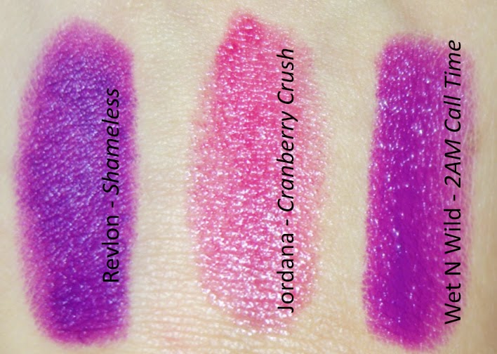
I was so intrigued by 2AM Call Time and I just had to compare it to other similar colors from the drugstore from my collection. I have the Revlon Colorburst Matte Balm in "Shameless" and the Jordana Twist & Shine in "Cranberry Crush" for comparison.

Wet N Wild Megaslicks Balm Stain "2AM Call Time" Comparison

You can see from the swatches above that the Jordana Twist & Shine Moisturizing Balm Stain in "Cranberry Crush" is the most wearable of the bunch, applying more as a cranberry than a purple. The Revlon Colorburst Matte Balm in "Shameless" is a more matte, blue-toned purple, slightly deeper in saturation than the Wet N Wild Balm Stain in "2AM Call Time". I actually thought the Revlon Balm in "Shameless" was much patchier (you can even tell in the swatch) and it settles into the fine lines of my lips, something that the Wet N Wild Balm Stain does not. The biggest difference between the Revlon and Wet N Wild products is that the latter has a good amount of moisturizing and shine, while the former can be described as drying on the lips and is best worn with another balm underneath.

Do you own any of the Wet N Wild Megaslicks Balm Stains? Which color is your favorite and why? Let me know in the comments below!


Friday, September 12, 2014

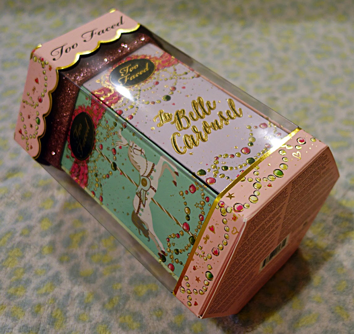
Product Review & Swatches: Too Faced La Belle Carousel - New Release for Holiday 2014


This is going to be an extremely picture-heavy post, so I apologize in advance but I am extremely excited about receiving the Too Faced "La Belle Carousel" after ordering it from Macys.com. The outer packaging is absolutely stunning, I love the artistic ornamental garlands surrounding the box and the scalloped golden edges of the packaging... plus it's a french carousel! What an adorable theme!


The inside looks just like a Christmas ornament, you could even hang it! The miniature palettes are held together pretty tightly by the glittery pink end-caps (these are made of a heavy duty cardboard).


Once the top is removed, inside you will find a look-book  with 4 looks: Sweet Soiree, La Belle, La Vie en Rose, and La Bonne Nuit. I always love it when companies include look-books, specifically when I'm feeling rather uninspired, I just take a peek and voila, a new look to try out!


When you pull out the individual components you will find that you have 5 miniature palettes and 1 Better Than Sex mascara (deluxe sized sample). The whole set retails for $49 but has an expected value of $282, so you're getting quite a deal!


A closer look at the opened palettes reveals 2 blush/bronzer palettes and 3 eyeshadow palettes (with 4 shadows in each - so you're getting 12 eyeshadows altogether). Let's take a closer look at the specifics of each palette.


The blush and bronzer palettes consist of Who's Your Poppy, Luminous Peach, Chocolate Soleil and Sun Bunny Dark. Who's Your Poppy is a rose red with glitter particles and Luminous Peach is a satin mid-toned orange. Chocolate Soleil is cocoa scented cool-leaning mid-tone bronzer and Sun Bunny Dark (the dark strip from the Sun Bunny bronzer) is a metallic orange-brown which reflects a lot of light.


Some of the shades in this range are re-promotes. Yule Log is a re-promote from last year's "Joy to the Girls" holiday palette and I find that they have the exact same consistency and performance. Sugar Plum Fairy also appears to be a re-promote of Sugar Plum from that same palette, it may be half a shade darker but they both suffer from pretty serious pilling in the pan due to the amount and size of glitter. Christmas Tree could be a shade close to Evergreen from the "A Few of my Favorite Things" Holiday 2013 palette, but I do not own that palette so I can't confirm it. Haute Chocolate is a re-promote from the Chocolate Bar palette as well, I don't see any difference between the two shades.

All of the shades performed well, though I want to make note that Frost is essentially an "overshadow" color that provides just some sparkle and glitter, but will not really provide much of a color on its own. I like that they included Tufted Suede in the palette (it's hard to see in my swatches since it is very close to my the color of my tanned skin). Santa's Boots was the only color I found to be chalky and rather hard to blend, also the black was not very pigmented and didn't travel easily when swatching. Some standout shades that I think are an absolute success in this palette are: Tin Soldier, Christmas Tree, Boxes & Bows, Angel Hair, Haute Chocolate (this one was my absolute favorite) and Yule Log.


I absolutely love this set and I think it would make a wonderful gift for any makeup lover! What a wonderful set, full of some new shades and a couple of re-promotes of successful holiday shades from last year. The eyeshadows feature a range of colors from highlighting colors to transition shades, darker crease shades and even pops of color. I love the size of the blushes and bronzers, you're getting a decent amount of product and all of the colors are very wearable on almost any skin-tone.

Is this set on your wishlist for the holidays?


NYC Sunny Bronzer Review & Bronzer Comparison


I finally caved and purchased the NYC Sunny bronzer ($2.99), not because I needed another bronzer, but because I wanted to see how it compared to a lot of others I have and whether or not it is a dupe for a higher end product.

From top to bottom, left to right: Wet N Wild Ticket to Brazil, elf Contouring Blush & Bronzing Powder (St. Lucia), NARS Blush/Bronzer Duo (Orgasm/Laguna), Too Faced Chocolate Soleil, tarte Park Ave Princess, NYC Smooth Skin (Sunny),  Physicians Formula Organic Wear Bronzer (Healthy Glow)
As you can see, I have quite a large variety of bronzers and I picked out some of the most popular ones to compare to. I like the compact of the NYC Smooth Skin Sunny bronzer, I think it looks a lot more high end than its $2.99 price tag.


Of my bronzers, the ones that suit my skin-tone best are probably Wet N Wild Ticket to Brazil, Physicians Formula Organic Wear Natural Glow Bronzer, and Too Faced Chocolate Soleil. So let's see how NYC's Sunny compares in the swatches below:


NYC Smooth Skin Sunny Bronzer was more smooth than the Wet n Wild Ticket to Brazil Bronzer and had no visible shimmer particles. I prefer bronzers that are more matte or satin, and I tend to stay away from overly shimmery products, which I why I sometimes opt out of wearing my Wet n Wild bronzer.

NYC Smooth Skin Sunny Bronzer appears to be a happy medium between my lightest shade (PF Organic Wear Bronzer in Natural Glow) and the Wet N Wild Ticket to Brazil Bronzer. NARS' Laguna is more cool-toned and taupe-like. Tarte's Park Ave. Princess Bronzer is more reddish and a deeper brown shade. E.L.F.'s St. Lucia Bronzer is definitely the darkest of the bunch (I almost never wear this one since it only matches my tone when I am very bronzed).

I highly recommend the NYC Sunny Bronzer if you're fair to light skin toned, I'm not sure how well this product could work for medium to deeper tones since it is a rather lighter bronzer. It definitely exudes a beautiful warm glow from the skin when applied, so if you are not a fan of warm tones, than this product isn't for you. I find that it's even useful for me to contour my nose with.

Do you have any of these bronzers? Let me know what you think about them and which one is your fav! Also let me know if you have any product suggestions for things I should try!


Product Review: Wet 'n Wild Intuitive Blend Foundation + Primer


I was perusing the aisles of my local Rite Aid a few days ago and I stumbled upon the Wet 'n Wild Intuitive Blend Shade Adjusting Foundation + Primer. Now, I realize this isn't a new product to their line but I hadn't seen it in previous displays, so it took this extended display for me to realize it was even there! It is a foundation AND primer priced only at $5.99 so I figured I would give it a go and review it.


The applicator is a simple squeeze-tube and I find these perfectly hygienic and simple to use. I like the ombre yet simple packaging of this foundation - and what really intrigued me was that this product claims to be a primer as well as a foundation, which would cut one step out of my morning beauty routine (and I'm all about simplifying).

I took a series of photographs to show you how the microbead shade-adjusting technology works:


This foundation provides light to medium coverage and performs like a BB cream or tinted moisturizer, but it really does do everything that it claims! I haven't experienced any pilling or greasiness, the foundation wore all day on my skin and my skin still felt smooth 8 hours in. I applied it with a brush and my fingers, I typically prefer a brush but it works well both ways. I did find that I had to use concealer for my under-eye circles as the coverage wasn't enough to give me the brightness I like (but this can be true for many medium coverage foundations).

All in all, I think this is a fantastic, well-priced product. It really is a no-muss no-fuss sort of morning product that is a ton of fun to use. The product range only consists of 4 shades Fair, Light, Medium and Tan, so choose the one that you normally fall into with other foundations you may use.

If you're interested in this product, I've linked all 4 shades (fair, light, medium and tan) below:

Related Posts Plugin for WordPress, Blogger...